Del CampoCreating the company’s first online storefront.
From a retail catalog to an online shopping experience. A storefront that brings product discovery, detailed information, and physical stores together.
My role: Website design & platform implementation
The project at a glance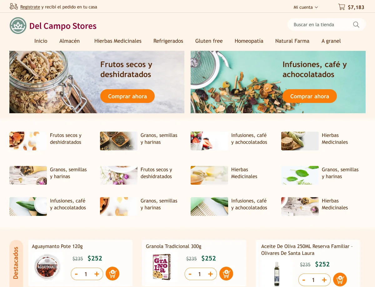
The project
at a glance.
I designed and implemented Del Campo’s first website on an e-commerce platform, connecting a varied product catalog with a consistent storefront for mobile and desktop.
- Project
- The company’s first website
- Experience
- E-commerce storefront
- My contribution
- Website design and platform implementation
- Design scope shown
- Home, categories, product details, and UI foundations
The challenge
Give the catalog a clear online structure, with paths for browsing categories, inspecting products, and finding store information.
The response
Combine category shortcuts, promotional entry points, repeatable product cards, and detailed product pages.
The delivered work
Website design and platform implementation, supported by coordinated mobile and desktop layouts and a shared UI style reference.
Several ways
into the catalog.
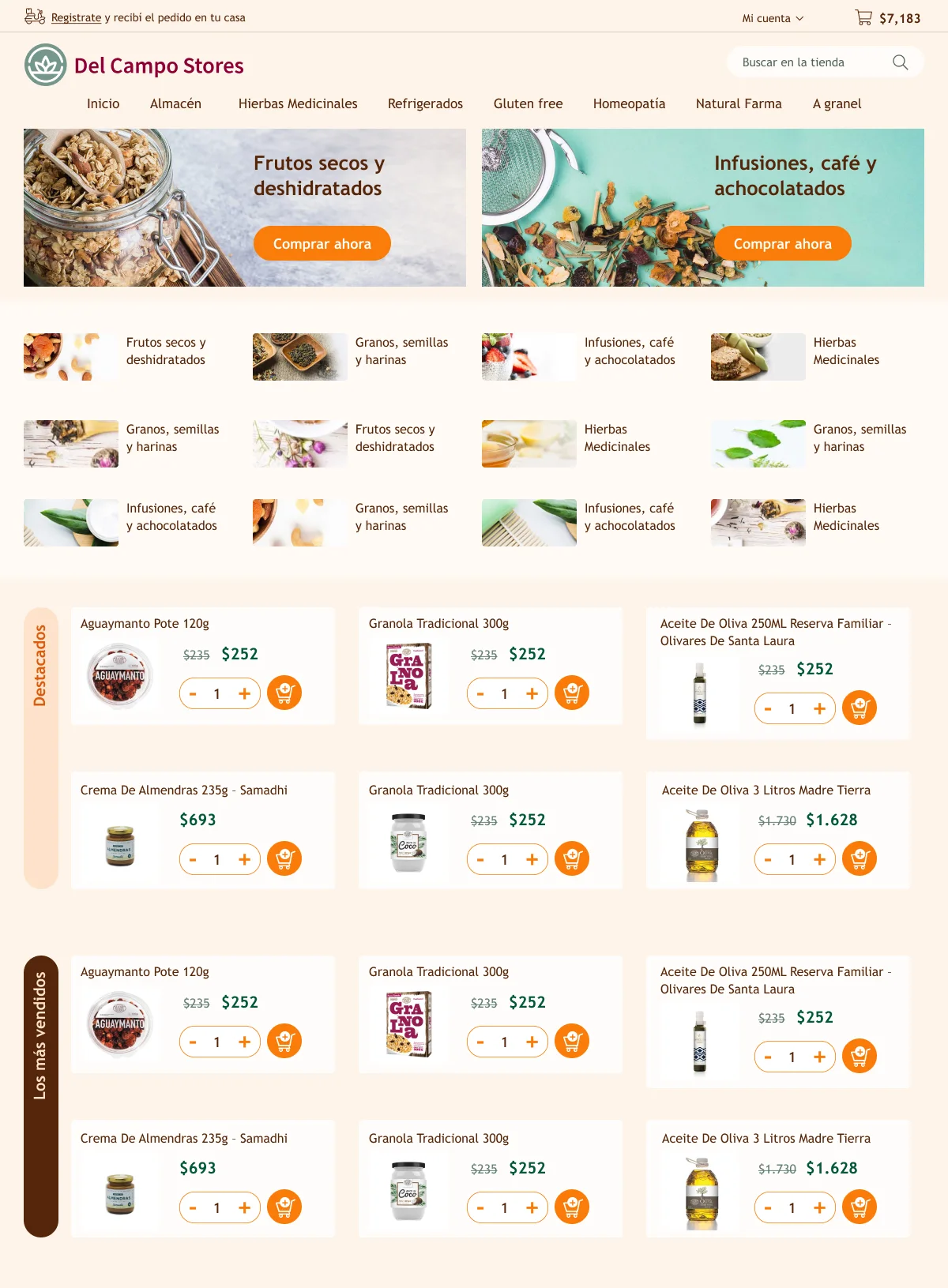
The homepage brings together image-led categories, promotional banners, and selected products. Direct category links support shoppers who know what they want; collections offer individual items to explore.
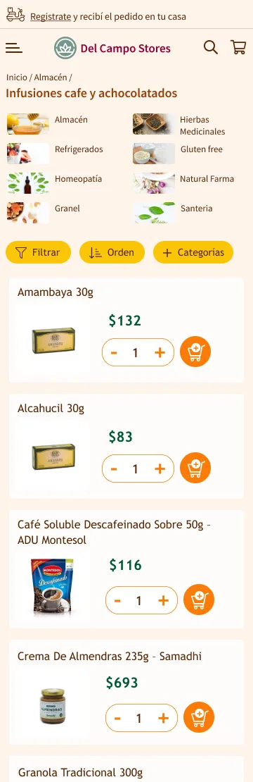
The category view puts filter, sort, and category controls above the product list, keeping browsing choices close to the items they affect.


Keep product interactions consistent
Each product card combines an image, name, price, quantity selector, and cart action. That structure repeats across the homepage, category listing, and related products.
Recompose for the available space
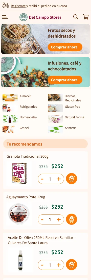
Desktop pairs promotional banners and uses a three-column product grid. Mobile stacks the banners and places products in a single column, retaining the same core information and controls.
Keep navigation within reach
The desktop header exposes search and horizontal category navigation. The mobile header condenses these into menu, search, and cart icons, while category shortcuts remain in the page content.
Connect browsing with physical stores
The shared mobile footer includes locations, opening hours, and contact details, giving shoppers practical store information alongside the catalog.
Give the details
their own space.
Start with the product
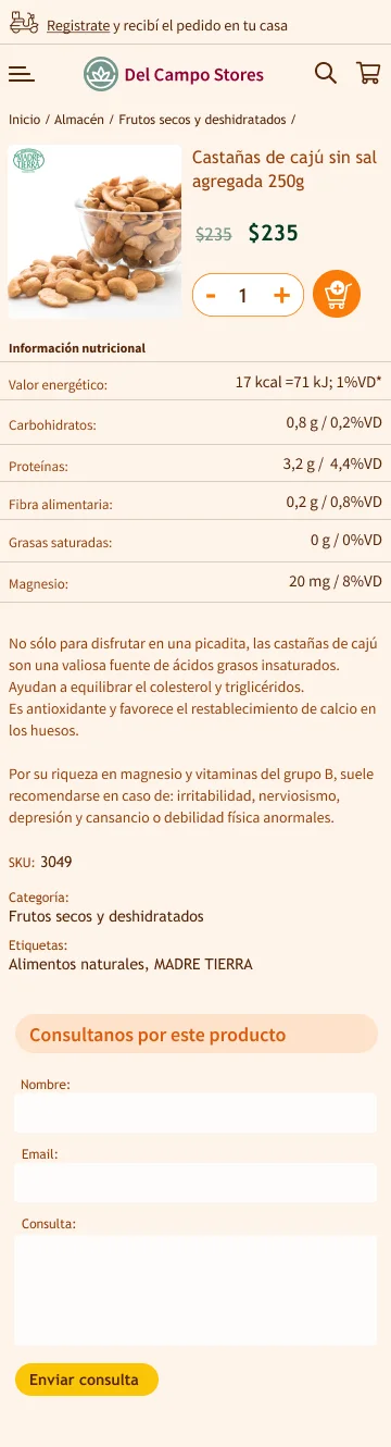
The image, title, price, and purchase controls sit together at the top. Shoppers can identify the item before moving into the supporting information.
Make room for closer inspection
A nutrition table, description, and product metadata have distinct places below the purchase area. The layout moves from a quick product overview into more detailed reading.
Keep questions in context
An inquiry form provides a contact point on the product page. Related products follow it, offering another route into the catalog.
A shared
visual language.
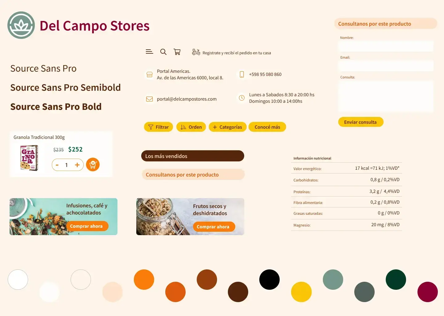
The UI style reference brings typography, colors, icons, buttons, product cards, forms, and table styling together. Source Sans Pro provides regular, semibold, and bold weights.
Warm cream and brown form the base. Orange purchase actions, yellow browsing and inquiry buttons, and green prices give recurring elements distinct roles across the storefront.
Design through
implementation.
My role covered both website design and platform implementation. That connected the storefront’s visual structure with the work of building it within an e-commerce platform.
The project established Del Campo’s first website. The retained materials show the catalog structure, consistent product interactions, and layouts composed for mobile and desktop, supported by shared visual foundations.